


Ranking MLB Uniforms by Color
Ranking MLB Uniforms by Color
This is part one of a three part series where I'll break down the best MLB uniform sets by color.

(Editor’s note: Some “white” uniforms may not be pictured here because they will be covered in a separate section that will rate all the cream colored unis in MLB)
In MLB there are a lot of great uniforms, along with some pretty bad ones. While some choices between unis are simple (The Yankees home is much better than Pittsburgh’s city connect) others are harder to judge. When teams sport uniforms with different colors, it can be a lot like comparing apples to oranges. A teams road gray might be pretty good, but when pitted up against a classic white it is often much harder do pick a clear favorite. Therefore, my mission today is to look for the best jerseys and compare them to similar designs, leading to a much fairer grading system than comparing purples to golds or greens to grays. In part one I’m going to start with the most classic look in sports, the home whites. So without further ado…
34: San Francisco Giants City Connect
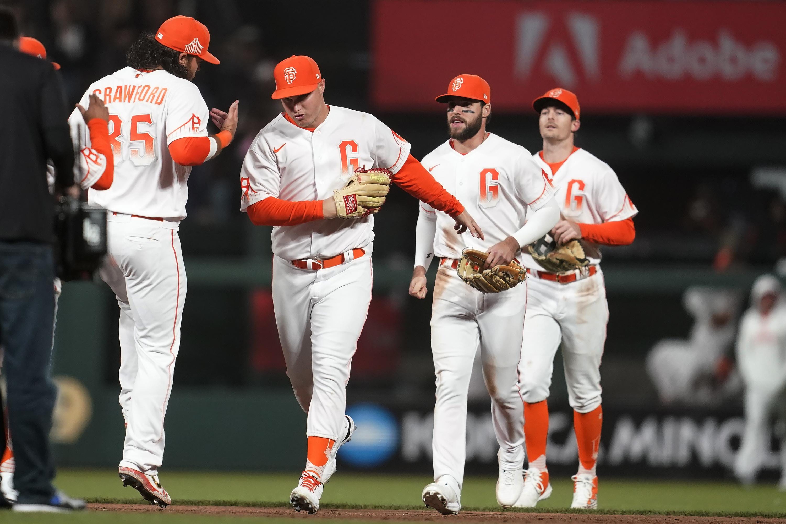
The main reason Nike launched the city connect series was for MLB teams to connect with fans by featuring local symbols on their threads. With San Francisco there’s a lot that comes to mind: Chinatown, trolley cars, sea lions. The Giants chose fog. Sure, there is a lot of it in the bay area, but it’s generally more an annoyance than a celebration. The jerseys themselves look like they typed the letter G into Microsoft word, added a gradient, and slapped it on a white background. The hats are just a worse version of their home caps, and overall the uniforms just look like they were made for a third-grade art project. Overall lazy design that ranks dead last among the white threads currently in the Major Leagues.
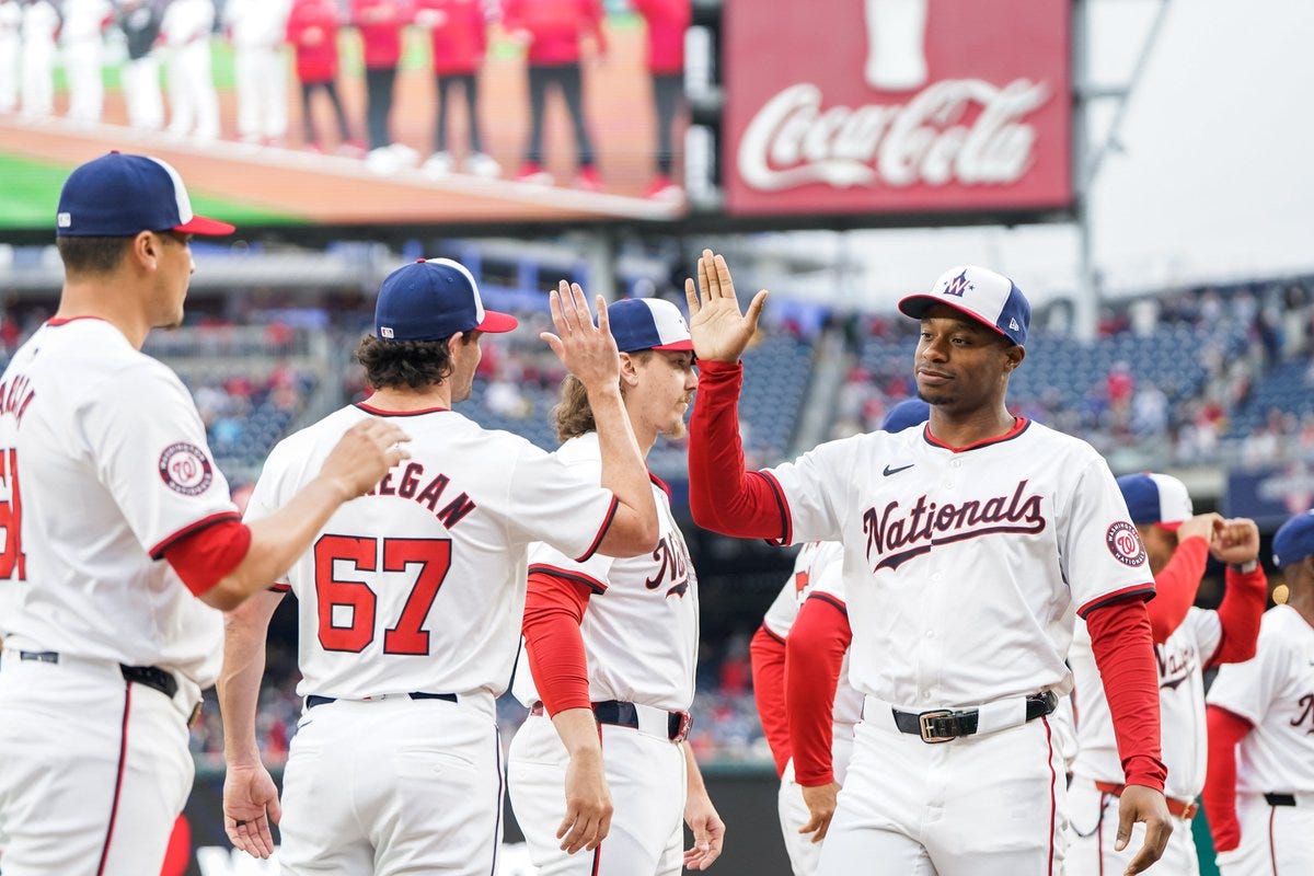
33: Washington Nationals Home Alternate

Well, it finally happened: the v-necks are back. This year Washington will not be wearing red alternates, instead opting towards the white look, slapping their alternate logo on the left chest. Presumably these uniforms will be worn with the same caps as their home unis, although the Nats haven’t announced this officially. Honestly, these look like little league jerseys, as the v-neck look is much less professional than the traditional button up style. While it is cool that Washington is trying to incorporate the capitol logo into their uniforms, this design should stay on the caps.
32: Minnesota Twins Primary Home
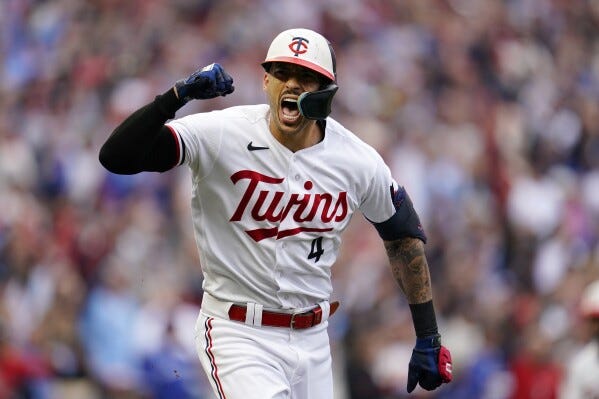
If it ain’t broke, don’t fix it. Up until 2022, the Twins sported one of the cleanest looks in sports. The navy script worked perfectly with the rose border and gold accents. In an attempt to “modernize” their look, the Twins have switched things up by simplifying their script and removing the border color. Overall I get what they were going for, but the oversimplified design falls way short of their past threads. Long story short, Minnesota’s current uni’s are a flop and it might be time to go to the drawing board once again.
31: Colorado Rockies Primary Home
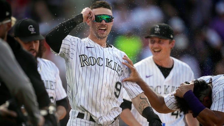
There’s nothing wrong per say with these uniforms, I just find them kind of boring. Overall I just think that they could do a little bit more with their colors, considering they are the only MLB team that sports purple. However, the gray lettering and black number on the front seems like it would make more sense for a team like the White Sox. Overall, I don’t find these jerseys bad, they just aren’t really all that exciting.
30: Los Angeles Angels Primary Home
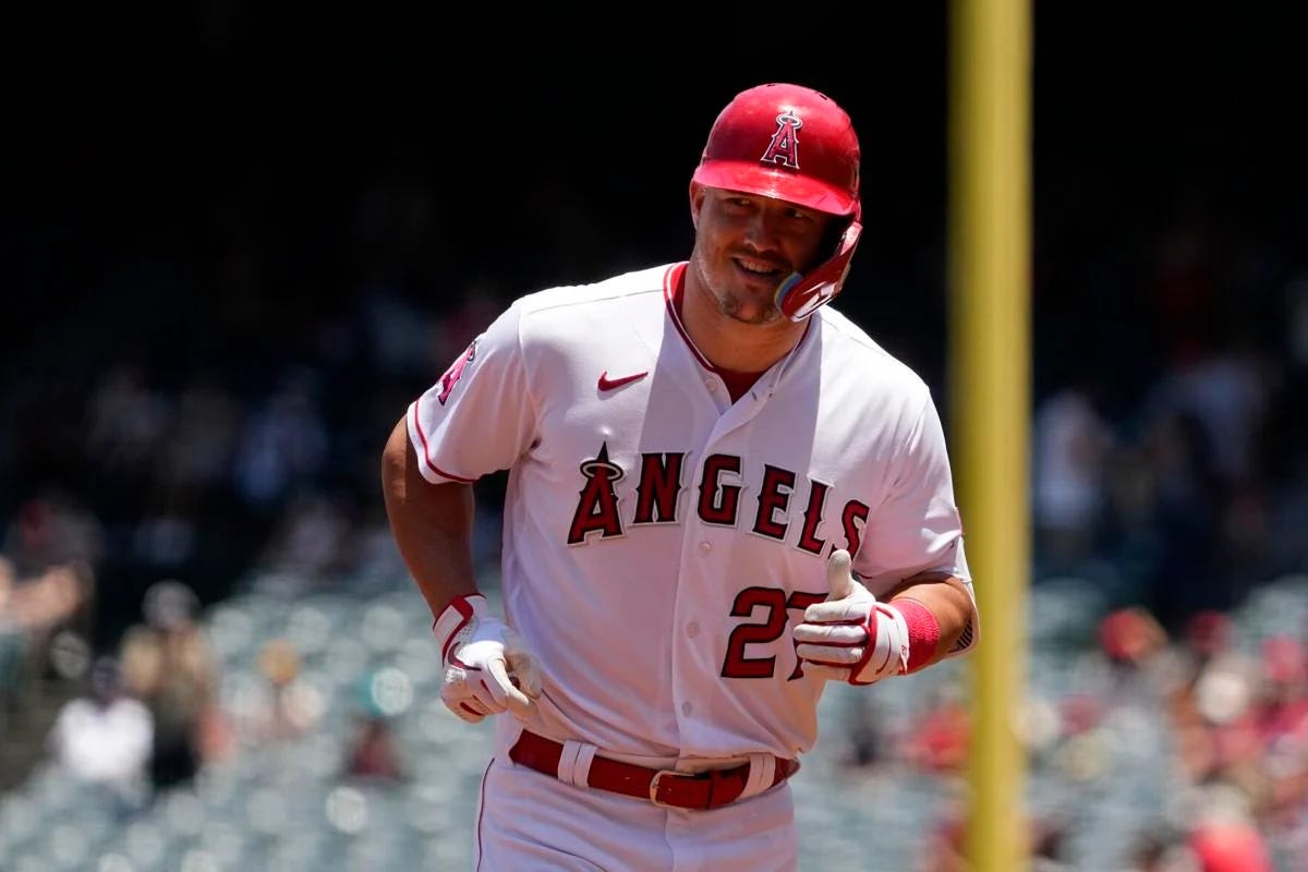
The verdict on this one is similar to Colorado’s: not bad, but boring. In the past the Angels were known for being a little adventurous, experimenting with a winged “A” logo and throwing in some navy and baby blue alternate colors. However, the 90’s ended and in came the red and whites! While these are clean, they are a little bit too basic, just featuring the Angels word mark and number font with little detail on the rest of the Jersey. Similarly to the Twins, they were looking for a fresh new look and opted to oversimplify their brand. Unlike the Twins, this design won the World Series in it’s very first year and has survived two decades, so it likely isn’t going anywhere.
29: Tampa Bay Rays Primary Home
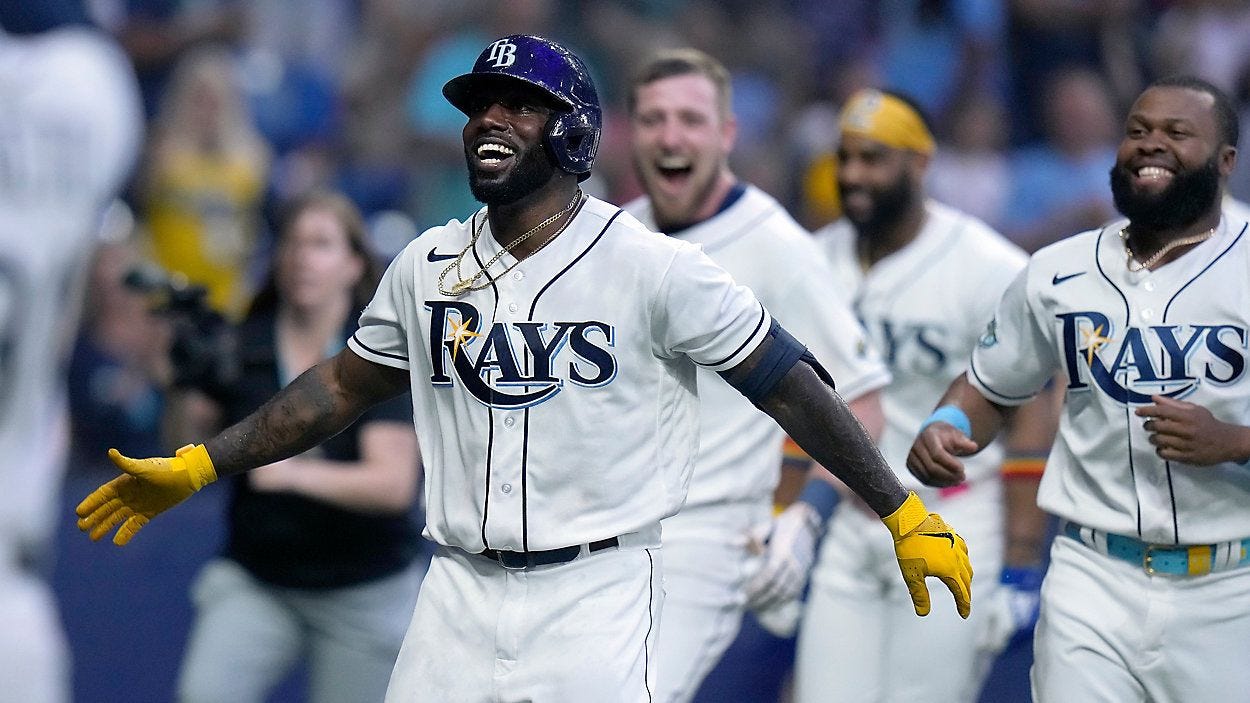
I actually really like Tampa Bay’s uniform set, I just don’t love the homes as much as I do the alternates. The alternate uni’s are super fun and show lot’s of color, while these are just a little too basic. These really aren’t terrible, I just generally prefer more detail, and a cooler jersey font would be nice. I don’t really have much else to say as these jerseys really are just about as plain and simple as it gets.
28: Atlanta Braves City Connect

This one’s all Nike’s fault. Going into 2022, Atlanta had the best throwback in baseball. The 1974 uniforms were perfect, sporting a retro “Braves” script along with the iconic lowercase “a.” However, the 4+1 rule led to Atlanta needing to cut some jerseys out, and the throwback was put on the chopping block, along with their Sunday creams. When faced with the task of making City Connect Uniforms, Atlanta decided to keep the Hank Aaron design, but changed it up in a less desirable way. While I don’t hate these kits, the old jerseys these replaced were so much better, featuring the actual logos and script that the team donned in this era.
27: Houston Astros Primary Home
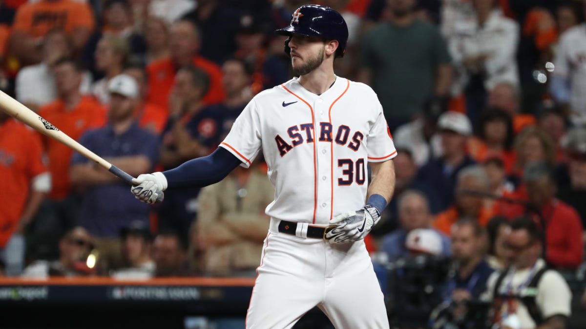
The only reason these aren't higher on the list is that I like their color combination. Looking beyond the color scheme though, these really aren’t the best uniforms. The block lettering is not creative, it’s off-centered, and the uniform lacks detail. The only redeeming factor about this uniform set is the color choice. The navy blue and burnt orange is the best color combo so far, and it really pop’s off the jerseys, giving the Astros a slight edge over the teams below it on this list.
26: Pittsburgh Pirates Primary Home
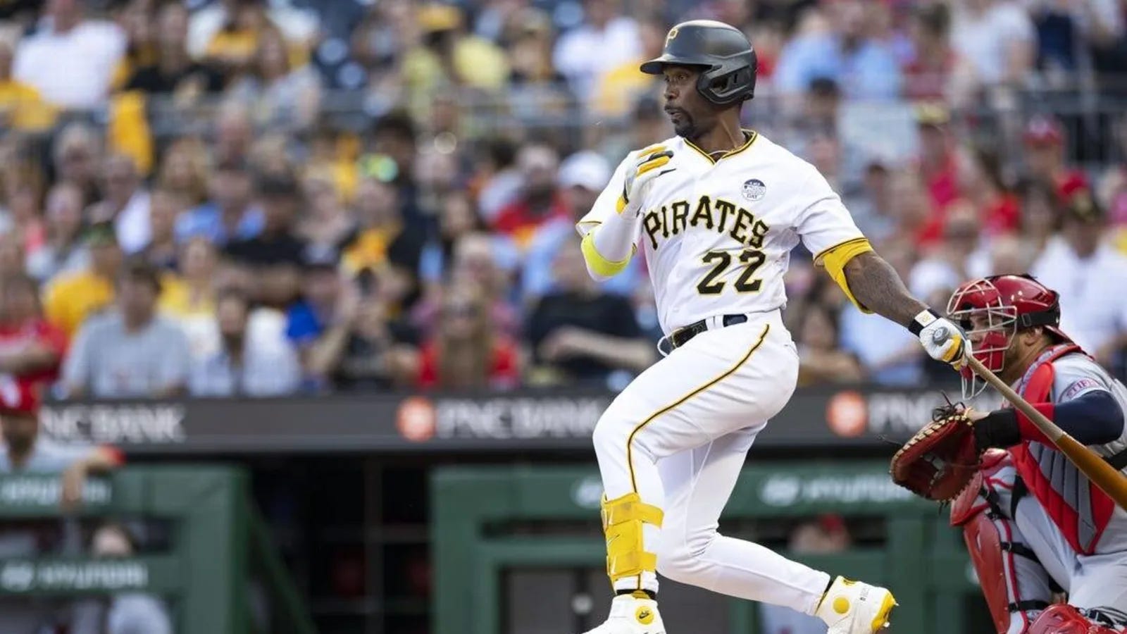
From here on out, every uniform pictured will be a “good” design. First I had to get the bad ones out of the way, but now the rankings turn into a contest of which good jersey is better than the other good jerseys. And starting off with the worst good jersey is Pittsburgh! My favorite part about these is the fact that they use their own unique font and that it lines up with their cap font as well. Too often teams will be inconsistent and put something on the caps that doesn’t line up with the shirts (I’m looking at you, Giants City Connect). The Pirates have developed a brand for themselves, and sticking to it was the best thing they could’ve done (although adding some piping or other details could elevate this design to the next level.
25: Miami Marlins Primary Home
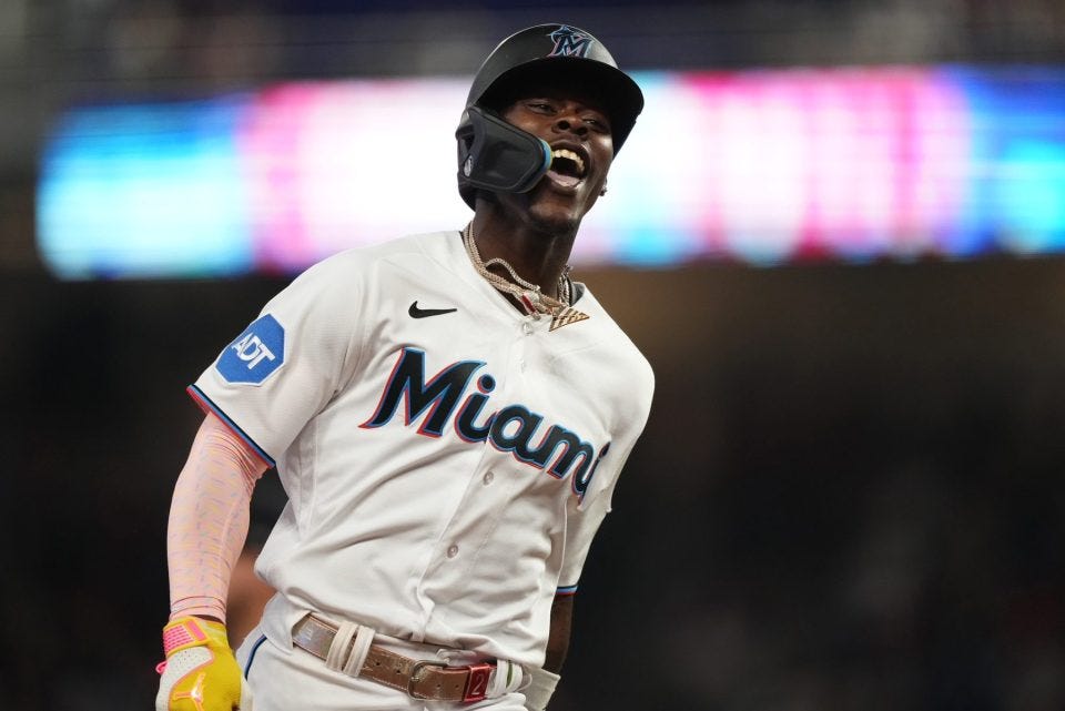
I like the font, I like the colors, and I like the caps. In fact, I seriously considered ranking these much higher on the list, but the one thing that frustrates me is the lack of the team name on the front. I guess it’s just one of my pet peeves, but I’ve always felt city names should go on the road grays and the team nickname should be on the home whites. The Marlins have failed to reach my expectations, so if I just made a bunch of Miami fans mad I apologize for being objectively correct.
24: Washington Nationals Primary Home
The thing that bugs me about these uniforms is the fact that the primary home hat sports their alternate logo. Another problem with the headgear is that the batting helmets don’t match their caps. Several of these small issues bring down the overall ranking a little bit, but overall I think the Nat’s home jerseys are pretty solid and are a massive step up from their v-neck alternates.
23: Cleveland Guardians Primary Home
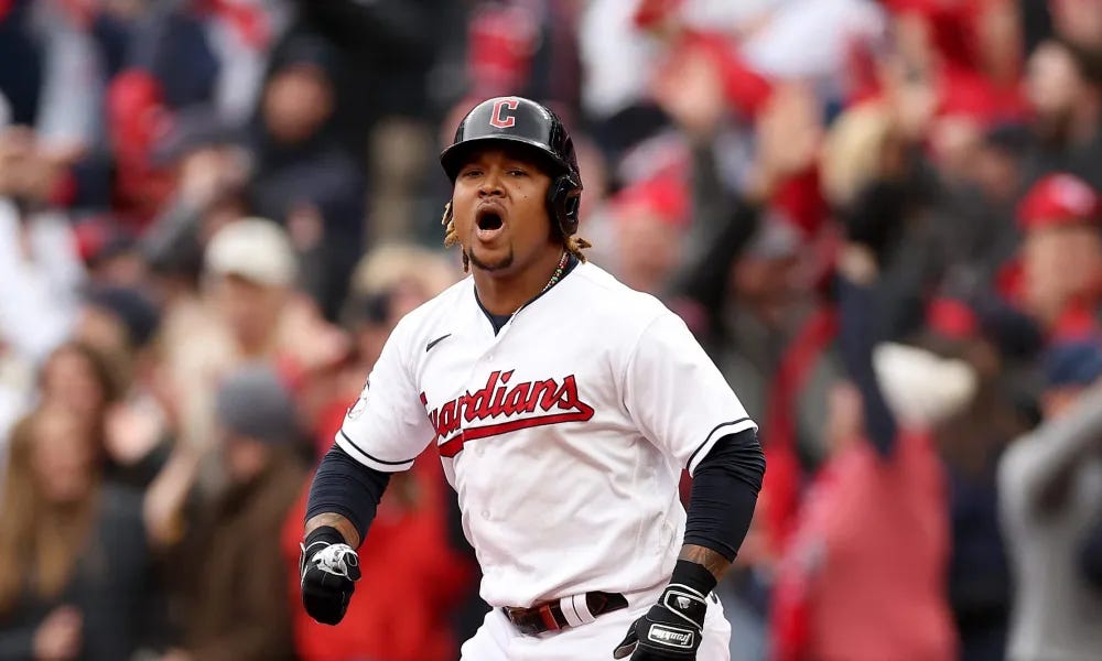
I honestly don’t understand all the hate these new uni’s get. Sure, the old Indians jerseys had a better design (despite having an insensitive name), but the Guardian’s rebrand looks similar and is a pretty clean look. The “C” that they have on the caps is definitely an upgrade from the former block letter, as it now has more depth to it. I know many baseball fans would place this near the bottom of their rankings, but I personally think Jose Ramirez and Shane Bieber look fantastic in the white and red.
22: Chicago White Sox Home Throwback

Personally, I think this is an ugly design, but it gets bonus points for being a throwback (and yes, that is a V-neck). I love how a few teams in the league still make an effort to put out “Throwback Thursdays” despite Nike killing most of them off. Considering Chicago only has three primary uniforms, it just made sense to put a throwback in the fourth slot. While there are some teams that do have better throwbacks, these are a pretty cool look, and every now and then it’s fun to see the Chi Sox back in the red, white, and blue. It’s a good idea and it isn’t anybody’s fault that they’re so low (except the people who designed them in the eighties). Let’s just be glad they aren’t trying to bring back the Bermuda shorts!
21: Philadelphia Phillies Primary Home

These are solid uniforms that are beloved by Phillies fans. However, they just miss the top twenty because there is a little too much red with there being a red script on top of the red pinstripes. Still this combo is a great look as the “Phillies” cursive script is one of my favorites in baseball, and the red cap is iconic. Overall, the Fightin’ Phils have a good look that’s clean, classic, and is perfect for Bryce Harper.
20: Baltimore Orioles Primary Home
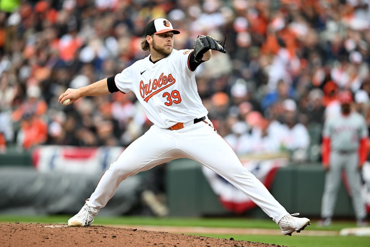
The Orioles look good. I don’t really know what else to say, as this is just a simple look that works. It’s nothing special, as it just uses a basic cursive script and solid numbers. The exciting part of this uniform however, is the cap. This bird is so awesome, I love it so much, and think that it might be the best logo in all of sports. The tricolor look is so hard to pull off but the Orioles did the black/white/orange hats perfectly. The jerseys are good. The hats are legendary.
19: Atlanta Braves Primary Home
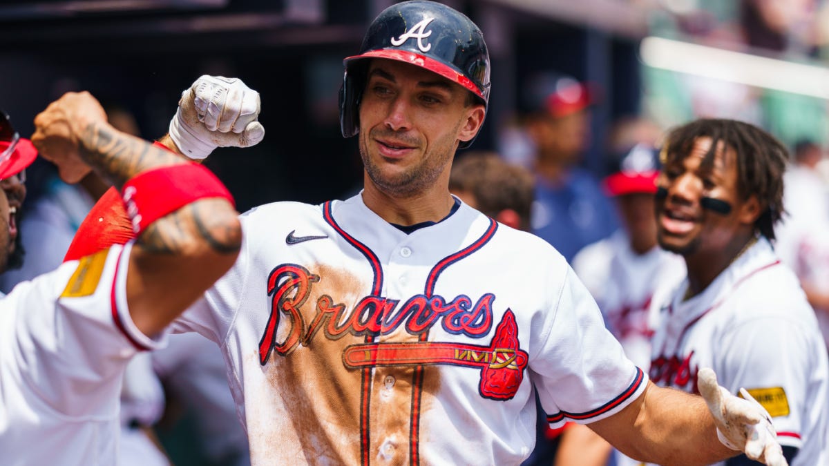
My favorite part about this uniform design is the creative liberties that are taken despite keeping a traditional feel. While the Braves have sported better uniforms in the past (the Hank Aaron jerseys are iconic), these are definitely solid. The tomahawk logo is pretty cool and is a fresh alternative to the cursive tail, and the hat features a red bill that provides variety. While this isn’t the best jersey in the league, it’s not bad by any means and it ranks towards the middle of the pack among the home whites.
18: Milwaukee Brewers Primary Home
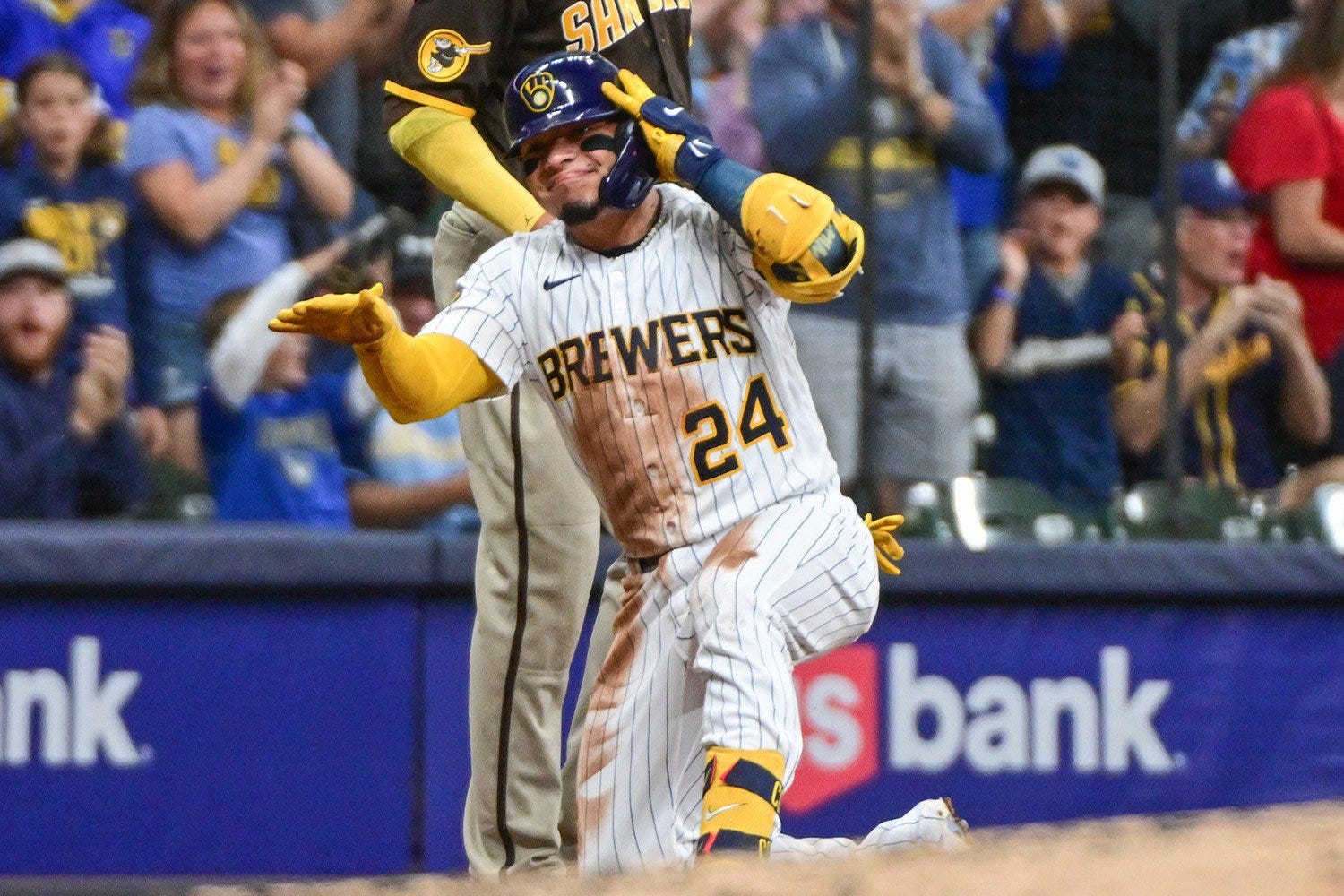
What the Minnesota Twins messed up so horribly, the Milwaukee Brewers executed to perfection. Towards the end of the 2010’s, the Brewers were reaching the end of an era and were looking for an updated look. While Minnesota looked towards a simplified version of their brand to appeal to younger fans, the Brewers looked in the opposite direction. Rather than going back to the drawing board, the Brewers brought back the old set they used in the 1980’s. However, to make it a little better they updated the blue and went with Packer’s yellow to deliver one of the best rebrands in recent history the pinstriped whites are perfect, and they go together great with the revamped ball-in-glove logo. And while the home whites rank only at #18, their alternate unis are even better along with a perfectly executed City Connect jersey.
17: Kansas City Royals Primary Home
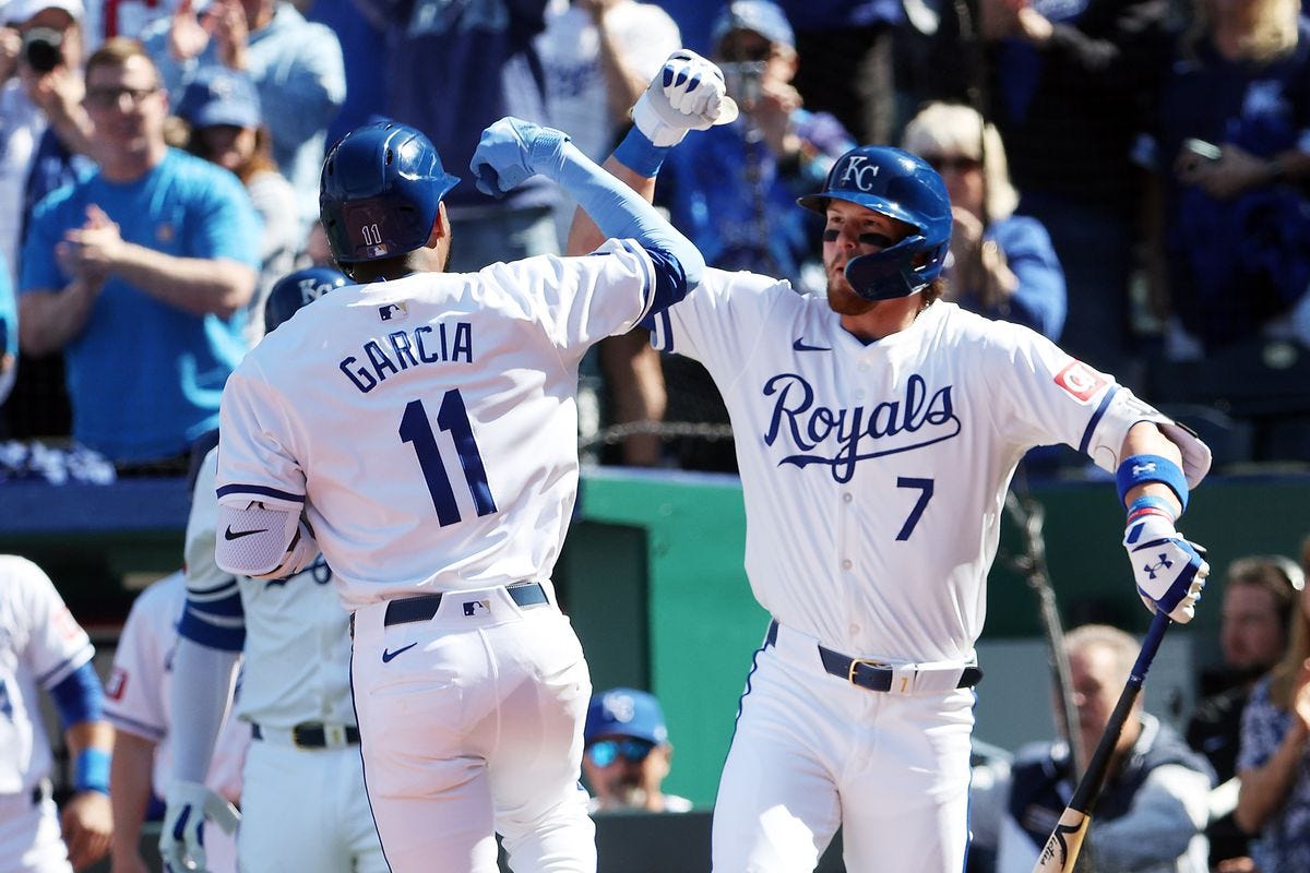
While these uniforms definitely took a hit when they added the QT patch, they still are some of the best in the central. While using only two colors is often problematic for teams, the Royals definitely did a good job at executing their look. The caps are clean, and the jerseys feature a nice cursive script that stretches across the top of the shirt. Another difficult feature to execute is the number on the front, but the Royals didn’t seem to have any problem fitting it in. While these are good looking, they are a little too safe for me to rank high, so I’ll leave them at 17 for now and let a few more adventurous squads take the top spots.
16: Cincinatti Reds Primary Home
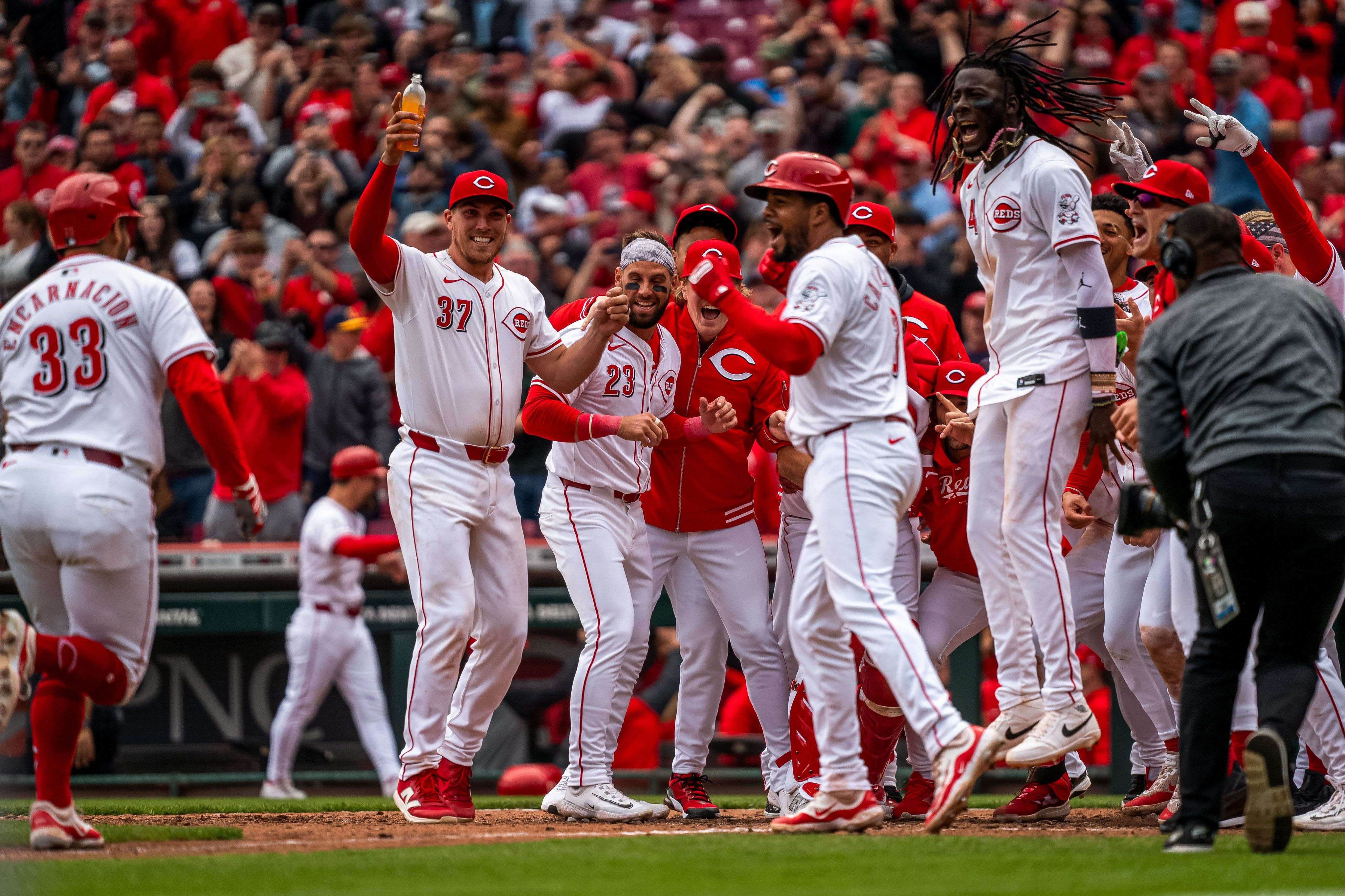
Considering the Reds have been around for over 150 years, they sure have changed their uniform sets a lot. Many historic franchises like the Yankees or Red Sox generally stick to one look for decades at a time. However, the Reds are notorious for experimenting with black uniforms, v-necks, and blue alternates. However, one look that has always come back is the standard whites. By this point, everyone knows this look, and while it isn’t anything special, it’s a clear classic. While I don’t love the “Reds” script inside of the jersey’s “C” logo, the clean piping and solid red cap more than make up for it.
15: Boston Red Sox Primary Home
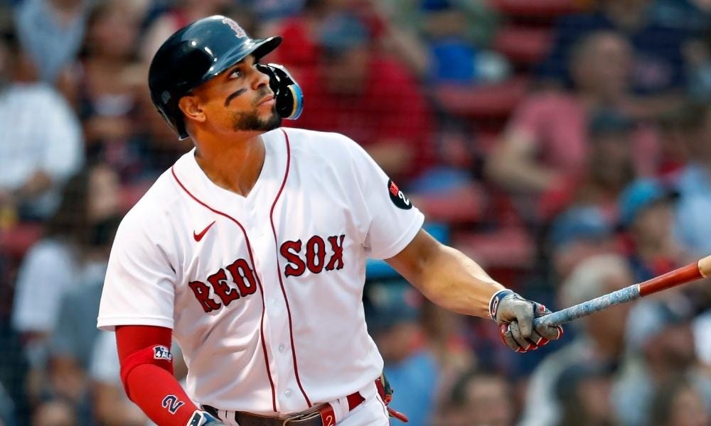
These threads are beloved by many and have stuck around for a century for a reason. Honestly, I think these are really good uniforms that do everything right: they’ve established a well-known brand, kept a consistent pattern, and use a solid color scheme. However, I do have these out of my top 10, instead coming down as low as 15 in the final order. While I do think these jerseys are a little bit overrated, I don’t really have any negative comments to give. It’s just hard for me to rank them above some more interesting uniform combos like the Mariners homes or the Padres City Connects. So just to make things clear, I do like these jerseys, but 15 just seems to be the right spot for this set.
14: Seattle Mariners Primary Home
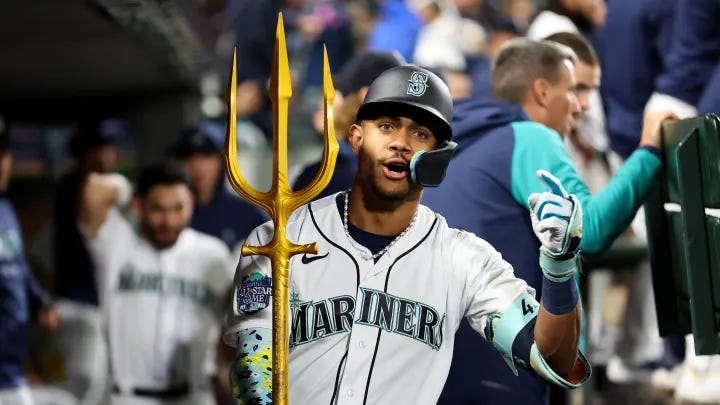
This is definitely a set that is highly underrated. The navy and green go perfectly together, the blue piping pops, and the compass in the “M” is a nice little detail that elevates this design to the next level. While many teams generally slap a logo on some pinstripes, or just use a plain wordmark, the M’s managed to do both and make it look nice. This might be their best primary uniform ever, or at least since the switch to the green and blue color scheme. While the Red Sox uniform may get a little too much love, this one doesn’t get nearly enough. It checks all the boxes for a good uniform design and it looks really good on their superstars. I mean, tell me who wouldn’t want a number 44 J-Rod jersey.
13: San Diego Padres Primary Home
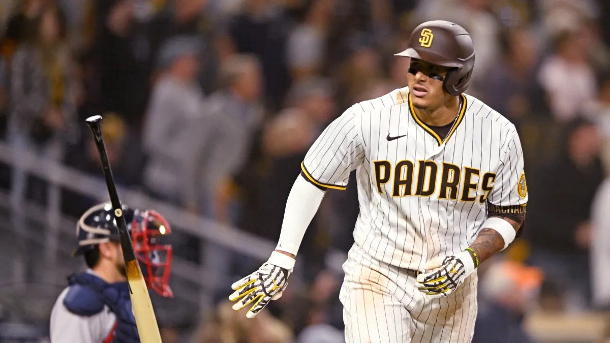
The Padres basically did what the Brewers did, but they did it even better. The updated look is awesome as it uses elements from their old 1970’s and 80’s threads, and while I did like their blue era, I think many people knew it was time for a change. While I don’t typically like brown on sports Uni’s, the Padres yellow accents make it work great. I also love the oversized letters on the front and, most of all, the friar patch is a perfect throwback. This is a perfect rebrand that has correlated with the Padre’s rise to success, leading to a fan favorite set that will stick around for several years. The Twins and Marlins should be taking notes!
12: Texas Rangers Primary Home

Remember back when these guys had “Texas” on all four of their jerseys? Those days are behind us now as these uni’s are a massive step up from the old “Texas” whites that this team wore in the late 2010’s. The fresh whites are awesome when paired with the new “Rangers” script and the blue hats display the “T” logo perfectly. Overall, this gets a high grade for me and finishes second among the AL west uni’s, edging out the Mariners, Astros, and Angels. Hats off to Texas!
11: Toronto Blue Jays Primary Home
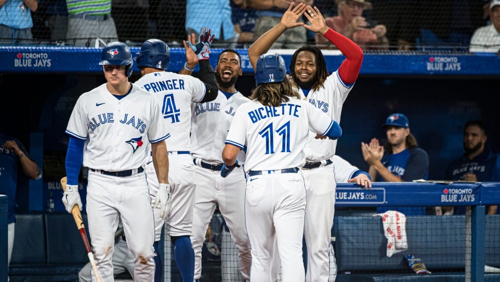
These is a more traditional look, but the bird on the jersey is amazing. I can’t talk enough about how much I love the blue jay featured on these threads. It’s a beautiful bird, and the maple leaf featured on the back of the head is a great nod to their host nation. These are great unis that represent Canada well, and even beyond the bird the jerseys feature great detail without overdoing it. I love the script, love the numbers, and think the whole uniform fits together great.
10: Chicago Cubs Primary Home
The first threads to crack the top ten, Chicago sports an absolute classic look that has stuck around for a while. I like the pinstripe look, and the cubbie patch on the side looks good, along with a cool blue cap. As I said in the Red’s review, I don’t love the script within the letter which is the main reason this isn’t higher on the list, but the rest of the jersey looks super clean and the hat is one of the best in the league.
9: St. Louis Cardinals Primary Home

As some may have caught on by now, I love putting birds on uniforms, and since St. Louis has two birds, they crack the top ten on this list. The red numbers are also a good look, and the cursive lettering weaving through the baseball bat is a super creative script that I love. The only thing that could elevate this would be to use more of their blue accent color as the red on these is a little overpowering, but other than that there isn’t really anything wrong with these jerseys, putting them in the top ten easily.
8: New York Mets Primary Home
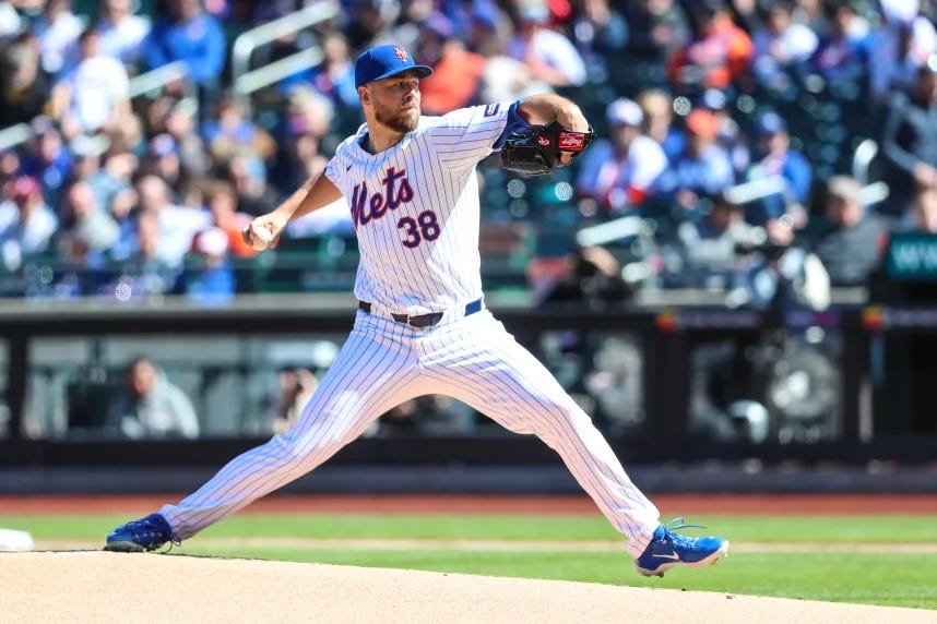
This is a great example of a uniform where everything just works. The pinstripes look solid, the cap is great, and it features a great script and number combo. Oftentimes teams will mismatch their numbers and script, but the Mets chose to stick with a blue and orange design that works great. The caps have a throwback “NY” that resembles the old New York Giants and the script is similar to the Brooklyn Dodgers. The similarities in the uniform and colors to these relocated teams is supposed to represent the Mets as the NL’s New York team, giving them historical significance to fans of these franchises. These Uni’s have a great design that’s clean, classic, and has lots of history.
7: San Diego Padres City Connect

This is a City Connect jersey that was done absolutely perfectly. It’s fresh, it’s vibrant and represents the Padres location super well, and it has cultural significance by representing the local Mexican population. As the only uniform on this list to sport pink, it definitely represents itself well, along with the sea-foam green and Padre yellow that accents this look so well. Looking beyond the shirts, these kits are paired with an amazing cap that is perfect for summer days. If Padres fans didn’t already have enough to be excited about, this is definitely another part of Padres baseball to cheer on.
6: Oakland Athletics Primary Home
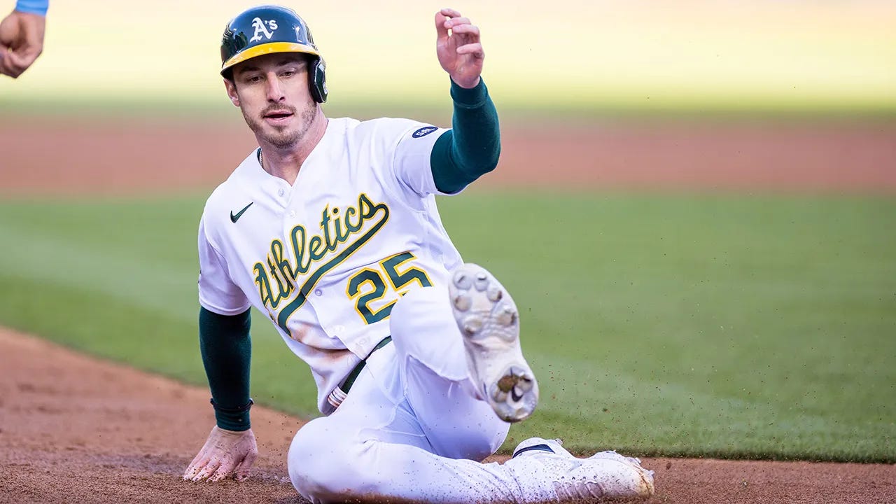
Ah, the A’s. Such a bad team, but such great uniforms. In the near future I may have to update this list with the Las Vegas A’s in this slot, but for now Oakland is their home. However, this is not a baseball ownership article, this is an article about uniforms and talk about the uniforms we must. Part of what led me to rank these so high is the hats, as they are some of the best in the game. The crisp white “A’s” is a staple that has stuck around no matter where the Athletics have played. The hat itself has a good design that executes a bi-color design similar to Atlanta’s, and the jerseys also sport the green and gold. Speaking of the jerseys, I love them so much because of the excellent script. The tail works perfectly, the gold outline makes it pop, and the number at the bottom is perfectly placed. These uniforms are hands down some of the best in the league, it’s just a shame they can’t field a good team to wear them.
5: Tampa Bay Devil Rays Home Throwback
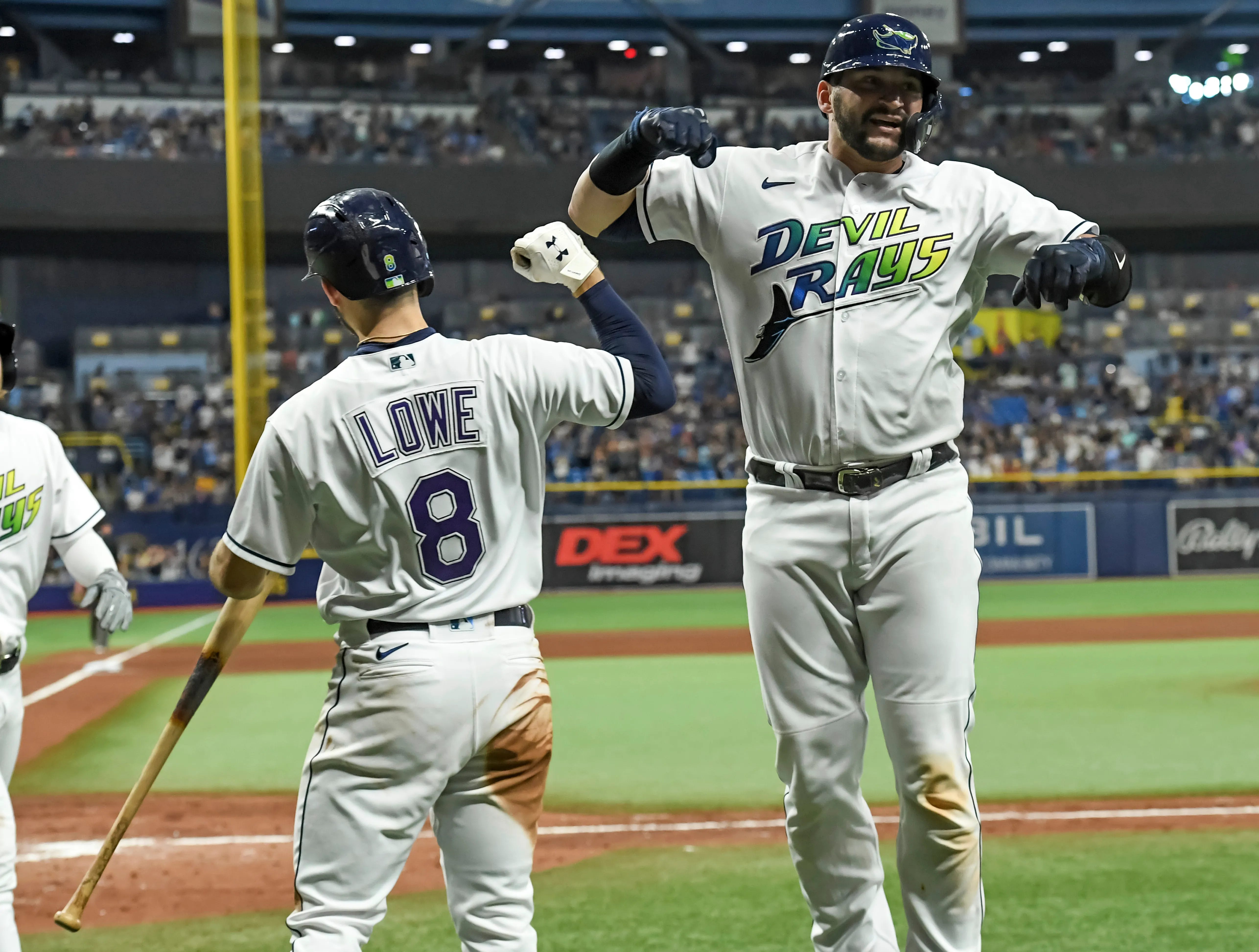
The best throwbacks in baseball are… the Tampa Bay Devil Rays! I cannot express how happy I am Tampa decided to bring back the retro look, as these are super cool and, although some would disagree, they are even better than some classic sets like Boston and St. Louis’s home whites. Although I would likely not be as high on these if they were current jerseys, they are super fun to watch on Friday nights. The text gradient is super cool and the devil ray gliding across the chest just adds great detail to the threads. As far as the cap goes I don’t think I have to say much: they’re just cool. Considering the Rays dropped their road grays to keep these, they have lived up to all the hype and I am looking forward to seeing these in action once again this season.
4: New York Yankees Primary Home
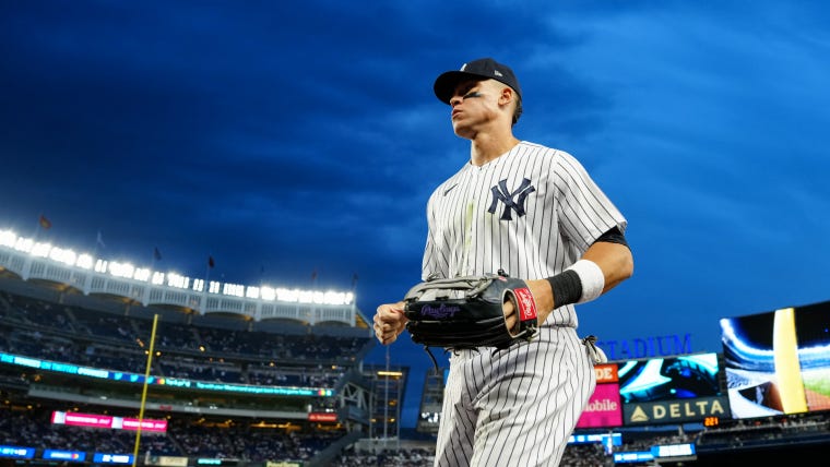
I know everyone in New York is gonna come after me for this pick. Don’t get me wrong, these are great uniforms, but there are a couple of Uni’s that just edge it out. However, New York definitely does have a great home white that has stood the test of time because of it’s clean, simple look that is instantly recognizable among anyone in America. The pinstripes are a look that the Yankees practically invented, and their caps are just iconic in American pop culture. These uniforms are pretty much perfect and are one of the best unis in all of sports.
3: Los Angeles Dodgers Primary Home

With the Yankees coming in at number 4, the Dodgers had to win it, right? While LA also has iconic uniforms, they aren’t the best in the league as there is some competition coming from the central. However, I do like these jerseys a lot, and while the script is basic, it’s really good when paired with the numbers on the front. The caps are classic and can be seen worn everywhere from Korea to Kansas. And while these may not be listed at number one overall, they are the National Leagues best, so congratulations to the Dodger blue for putting on awesome uniforms for many years.
2: Detroit Tigers Primary Home
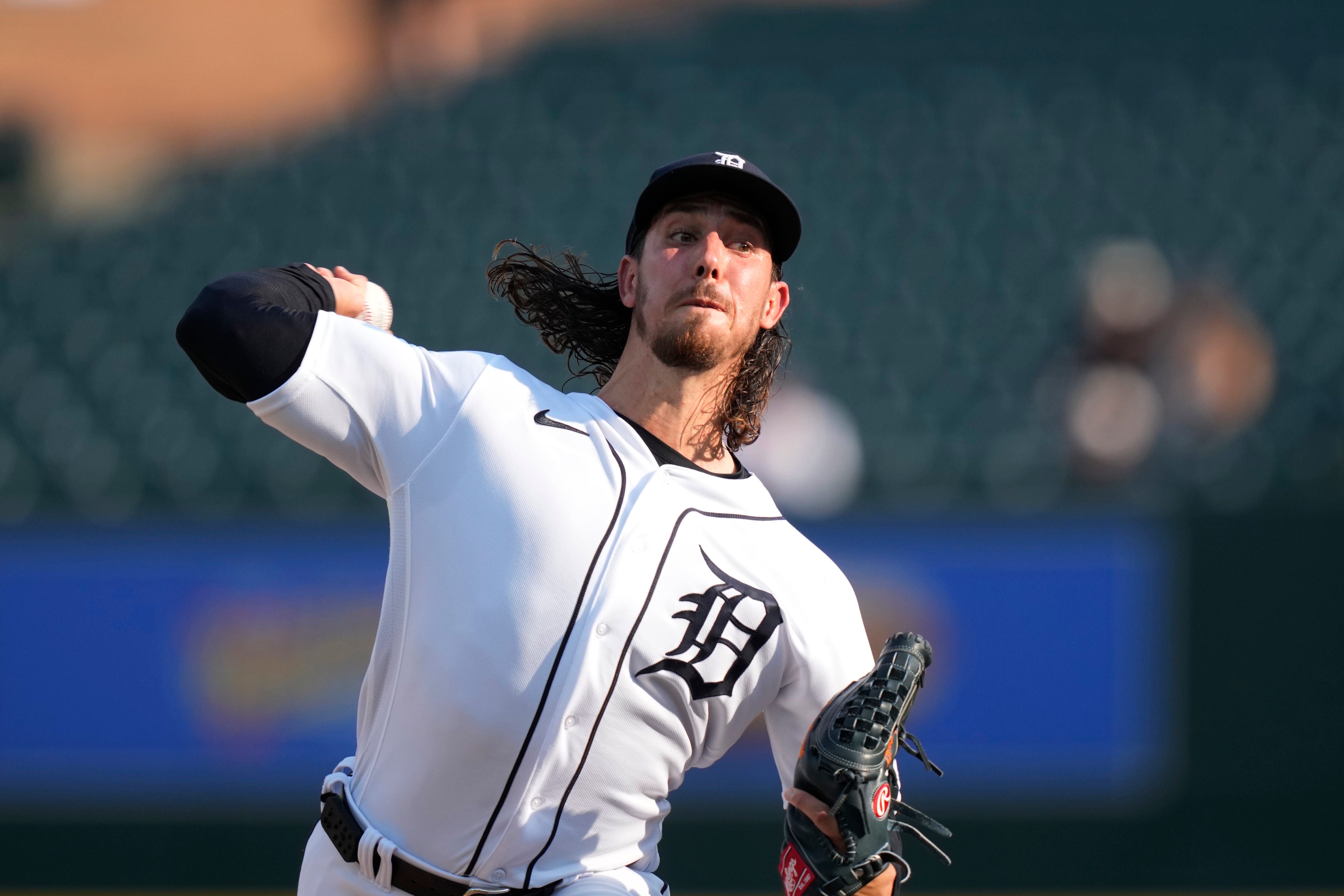
I know this is gonna surprise a lot of people, but I’m just speaking the truth: Detroit knows how to make good baseball uniforms. Putting the jerseys aside, the Tigers have created what I think is one of the best brands in baseball. The olde English “D” is epic, and it goes perfectly on the navy caps and the home whites?”aQO. While the whole “rounded D” experiment was fine, it’s great that they’ve gone back to their signature logo on their jerseys. However, these don’t win any awards, as they aren’t the best jerseys in the MLB, American League, or even their own division. That award goes to…
1: Chicago White Sox Primary Home
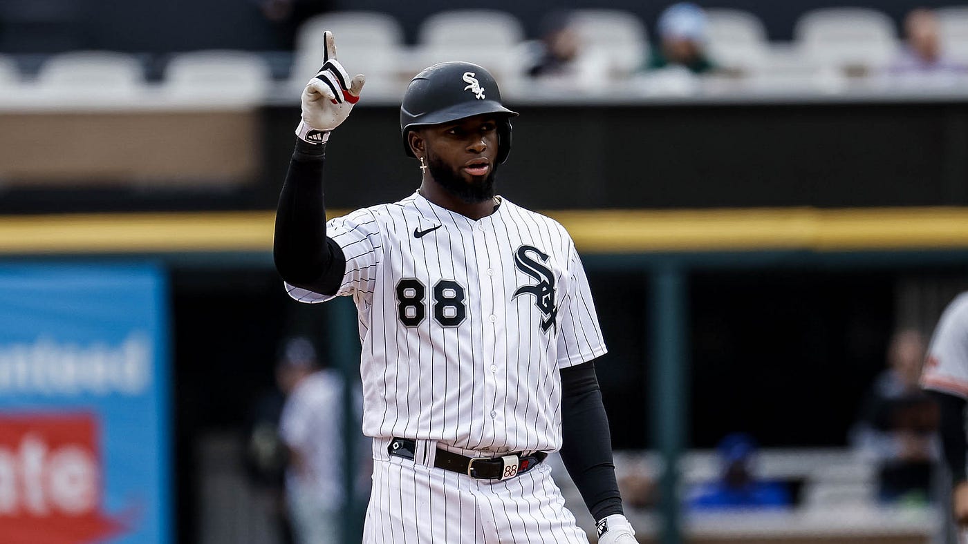
Chicago takes the gold here with an amazing design that checks all the boxes. The hats are iconic and might be the best in the game, and the black pinstriped jerseys are perfect. These uniforms use a lot of the same elements as the Yankees, but it’s a fresher design with a great logo that is just as solid on the shirts as it is on the caps. The simple uniform design contrasts perfectly with the complicated “sox” script that is iconic among baseball fans. These are just so perfect and I don’t understand why more MLB teams aren’t using these threads as inspiration. These are no doubt the best in the game and I always tune in to Chicago games when these are on the field.